Power Colors
What are Power Colors? They are colors are those that are no-fail, guaranteed-to-look-great on you colors.
In my deluxe swatches, the first 12 colors are categorized as that particular season’s Power Colors. I also list them in my 'Celebrate Your Season' eBooks.
Who exactly decides these colors? Well, I do. At least for my swatches.
My knowledge of color analysis was gained from color industry experts using the 4, 12, and 16 seasons. So most of these colors are generally accepted to be some of the best colors for particular seasons by most experts. I feel confident in my assessments.
Below I list one general color that is most associated with each of the 4 main seasons.
Then I will add one or two more colors to each of the original 12 Seasons, which I personally think of when I think of colors for them.
Power Colors for the 12-Seasons
While everyone loves black, with its slimming qualities and its ability to go with any other color, Winters are the only seasons that really light up in black.
Other colors I associate most with specific Winter sub-seasons:
Deep Winter

While all Winters have black in their palette, Deep Winters "own" this color. I also think of deep red when I think of this season (among other dark colors). Of course, for the best effect, they need to be combined with brighter colors to match their contrast level. But even if they only choose one color, Deep Winters can pull off Black or Dark Red all by itself.
Clear Winter

Hot pink and fuchsia are what I first think of when I think of these seasons. While these two colors overwhelm and can look artificial on the other three other main seasons, they can look quite natural on Clear Winters.
Tip: Too much black on a Clear Winter does not allow her to shine.
Cool Winter

True blue and pure white come to my mind first for this season. Here is why: True Blue is not super bright.
And Cool Winters are the lightest and most delicate of the Winter sub-seasons. You can’t get lighter than white. Of course, they are all cool and with no hint of warmth.
Every Summer can wear Blue, from the lightest to the deepest Summer. And most Summers can wear almost every shade of Blue, too. Blue is any Summer’s no-fail color.
Other colors I associate most with specific Summer sub-seasons:
Light Summer

Sky Blue and Light Pink are iconic of Light Summers.
While it can handle many other not-so-light summer colors, many of the darker summers might look washed out with only light shades (unless paired with deeper colors to create monochromatic looks). But Light Summer lights up in them.
Cool Summer

Medium Blue and Rose come to mind when I think of Cool Summers. Just like Deep Winters own black, Cool Summer is the season that own blue.
And rose is a color iconic to all Summers but it really brings out the rosiness in Cool Summer. Literally.
Soft Summer

Grey-Blue and mauve are always come to mind when I think of Soft Summers. It’s almost a requirement that many of the palette colors be softened or ‘toned’ with grey. This includes mauve and other muted purples like aubergine and antique purple. Mauve in particular is unflattering to so many other sub-seasons but soft summers thrive in it.
For most other seasons, brown isn’t a color they get excited about. But it is a must-have for Autumns. It is their best neutral. Dark browns are a great alternative to black for all Autumns.
Other colors I associate most with specific Autumn sub-seasons:
Warm Autumn

Warm brown and mustard are two colors I look for when I shop because I am a Warm Autumn.
Remember that this season is the most saturated of the sub-seasons so golden, earthy colors are what are best. I do think that only warm autumns can really rock mustard as a stand- alone color.
Soft Autumn

Terracotta and olive are the opposite of saturated, and they match the Soft Autumn's muted coloring beautifully.
Note: in my ColorBreeze, there are lighter & darker Soft Autumns, so the colors can be lighter or darker depending on the person's value.
Deep Autumn

Chocolate Brown and Burnt Orange always look great on Deep Autumns.
They are a great combination together, too, as Deep Autumns should pair deep earth tones with some somewhat bright Autumn colors to match it's need for high contrast.
If you don’t look good in yellow, you probably are not a Spring. Yellow is iconic to Springs.
Pure basic yellow looks good on every type of Spring but these are some specific colors, including specific shades of yellow, I associate most with the 3 basic sub-seasons:
Light Springs

Ivory and Peach look elegant on Light Springs. Ivory is a great alternative to pure white for all Springs but on Light Springs, it is truly a power color. Peach, also, is in every single Spring sub-seasons but it is one of my go-to colors for Light Springs in particular.
Warm Springs

Golden Yellow and Warm Peach are two colors that are ‘heavier’ than other variations, which is why they are perfect for Warm Springs. They are the heaviest Spring sub-seasons and the most warmest and most golden clear colors are best for them.
Clear Springs

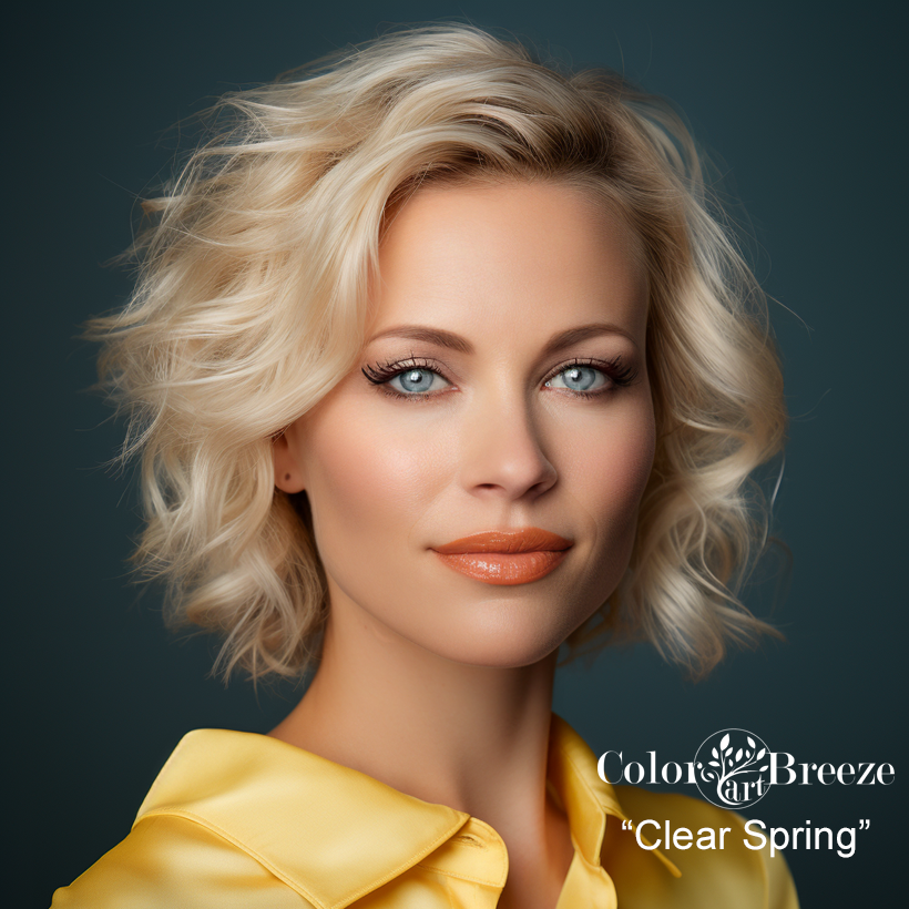
Bright Yellow and Bright Orange are the two colors I think of for this season. They can handle the brightest & highest wattage colors. These two shades would be too much for any other main season, and could even overwhelm some Spring sub-seasons. But the Clear Springs comes alive in them.
Fyi: the truth is, if a color in your palette is your favorite, it’s a Power Color for you 😉


